Happy (early) Friday! This week’s #fasterfridays covers a powerful tool for understanding processes and delays in your organization – Value Stream Mapping. It walks you through a small example, and then a real world example from one of my clients. If you’re interested in finding out how to apply this to your organization, don’t hesitate to reach out via Twitter or email hello at coryfoy dot com. Have a great weekend!
Transcript:
Hello! I’m Cory Foy, and in this Faster Fridays video I wanted to walk through a technique known as Value Stream Mapping. This is a powerful technique from Lean Manufacturing which allows you to understand not just your process, but the delays, queues and time spent in them to find out what’s really slowing you down.
In the upper left hand you can see a Value Stream Map I did for a client many years ago. This was obviously a rough sketch, but we were able to do it quickly. But what is a Value Stream Map? At its core, it is a way of visualizing the flow of work in a system. But the power comes from mapping your actual process – not how you want it to – or wish it did – work.
Our map begins at an entry point into the system. Ideally this is the very beginning, perhaps where an idea first gets introduced. We then walk through all of the steps until it leaves our system or we get the value we need, in this case, Shipping software. It’s possible for this to go even further. For example, a hospital’s value stream may not end when a patient is discharged – they may want to track post-discharge steps, follow up appointments, or even readmissions.
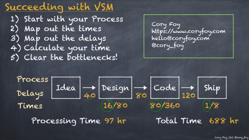
Once we have our process, we then look at the processing time in each step. In this case we’re dealing with people, not machines, so design may take 2 days of work, but it takes the designer two weeks to devote 2 full days towards the design. Likewise the development team may spend two full weeks developing, but it takes them 12 weeks to get those two weeks – either because of meetings, context switching, escalations and other work. Finally we ship it, which is a full-day deployment but our piece is only an hour of.
Now that we have our processing time, we need to look at our queues – or the places work sits while it’s waiting to move downstream. It is very rare to have perfect efficiency, so in this case we see that once an idea comes in it takes on average a week for Design to start, two weeks for development to start once design is done, and an average of three weeks for it to be deployed due to the organizations six-week deployment cycles.
So to close this out – our processing time calculated by adding up just the time spent working – was 97 hours – or about 2.5 weeks of work to go from idea to ship, it takes 688 hours to actually get it out the door – about 17 weeks – resulting in an 14% efficiency.
But is that real? That seems wasteful, doesn’t it? Now let’s go back take a look at that client diagram and actually sketch it out to see how it was.
In this case we start with a request coming in.
When we mapped all of this out, we found it was 286 hours of work over 1592 hours, or 7 Weeks of Work, but 10 months to get those 7 weeks. So when we talk about wanting to go faster, we didn’t need to look at engineering – we could drastically improve the responsiveness of the organization simply by reducing the queuing time between these steps, without even having to remove any of them!
So if you want to try it yourself, start with your own process. Map out the times inside steps, then the times in-between steps. Calculate your times, recover from your heart attack, and then work on clearing those bottlenecks! Your entire organization will thank you.
And if you get stuck or need any help, don’t hesitate to reach out at hello at coryfoy dot com. I regularly perform assessments and VSMs for clients in a wide variety of industries and governments, and would be more than happy to help yours.
Until next time, here’s to tracking down your delays!
